5.30.2014

On the horizon

The next three months are going to jam-filled...lots of activity...some art-related...some not!  But I wanted to let you know about three art-related events that, if you are in the area, you might want to look into...

First up...
the Artist Garage Sale
June 7, 8am - 3pm
Schack Art Center, Downtown Everett


This annual event rounds up a bevy of artists who are cleaning out their studios...from supplies and tools to original art, everything is priced to go...I'm clearing out a TON of supplies...selling it by the box or bagful...and also getting rid of original art collages...

New this year is an "early bird" entrance ticket...gives you first crack at the good stuff...get all the details on the Schack Art Center site...


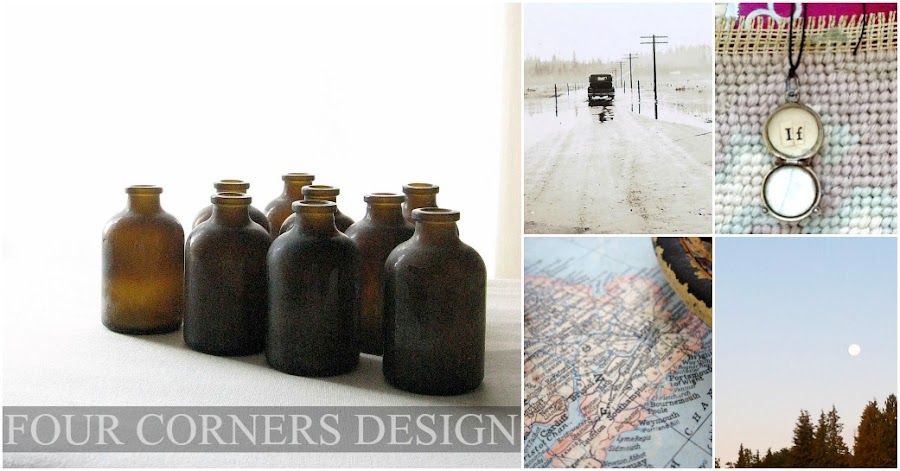
detail of "The Botanist's Study" by Amy Duncan


Second on the list...
I was notified this week that one of my collages has been accepted into the 19th Biennial Juried Art Show...highlighting the best of artists in the area, I'm honored to be included...details on the exhibit and a listing of the artists can be found here...my art friends Lisa Myers Bulmash and Lisa JonesMoore both have incredible pieces in this show...I'm in excellent company!


And Third...
Fresh Paint in August!  This annual juried show, held August 16 & 17 at the Everett Marina, not only gives you the chance to see 75 artists showcase their work...but watch as they demonstrate their artistic skill with hands-on activity.  I will have several original collages, both multi-media and digital available...I'm excited about the new direction I've taken this year with my work...this digital collage, The Primer, is one such example...


So mark your calendars...let's make a date...
please stop and say hi if you attend the Artist Garage Sale or Fresh Paint - I'd love to see you!

5.27.2014

Can't leave well enough alone...

Recently I visited my sister for the weekend...like me, she is de-cluttering...getting rid of stuff...paring down...

She had this box of metal parts...a mixture of all sorts of do-dads...I told her that I would be happy to add it to my stash that I'm taking to the Artist Garage Sale on June 7 (link here...if you are anywhere in the Seattle area, you need to be at this sale!)


But of course...since it was metal...and calling my name...I just had to have a look...and pull out a few pieces...and before you know it...metal addiction is hard to break...

What drew my interest were the threaded rods she had...leftover from the garden goddesses we made years ago...


Threaded rod comes from either taking apart an old lamp...or old sport trophies...its the center piece that holds everything together...and since old trophies multiply at the thrift stores...and are usually available for cheap, its a good source for this prized possession...


I pawed through the box...
a few lamp bases, a couple of washers & nuts and assorted odd pieces later, I created two display stands...


I added the curtain rings when I returned home...they were a tad shiny...
but nothing that a coat of aged bronzed spray paint couldn't diminish...


It was a matter of simple assembly for each of them...the bases are from old lamps...the top of the one is a lamp shade skeleton and the other is some sort of flat metal disk...
Having the right size washers and nuts are key...if you buy an old trophy to take apart, save the washers and nuts to use in your re-creation...

for the base assembly...


and the top assembly...


There's no end to what these two stands could be used for ...let your imagination roam...family photos at home, birthday cards from a celebration, menu selections on a buffet table for the clip ring stand...a bouquet of posies, a single elegant dessert cake or a decorative bird nest on the flat pedestal stand...

and speaking of bird nests...talk about recycling...those coconut fiber liners that you use in hanging baskets...at the end of the season...after you take them out of the basket because they are decomposing...dry them out...pull them apart...they make luscious nests...


linking up with kim klassen's texture tuesday...
and Knick of Time Vintage Inspiration Party...
join in...find a dream...be inspired...
make something out of nothing...

edited with kk texture rainy day soft light at 60%
and kk texture dream at darken 61%
french kiss postage brush


5.24.2014

Pay it forward

A couple of weeks ago, I signed up to participate in an art swap...a "Pay it Forward" exchange where you received a piece of art from one artist while you sent out 5 pieces of art to others...

I signed up via artjuvenation, the blog of artist John Arbuckle...I met John last year at the workshop I took from Seth Apter...its been a joy getting to know John who has a wonderful way with collage, especially incorporating color into the mix...

I received my collage from John...and I am thrilled with it...


You can read John's creative process about this piece here...

and you'll notice that the collage is perched so picture perfect on a shelf...I've been heading up a month-long exercise of posting "shelfies" on Instagram...the newest design craze where you post an interesting composition situated on a  shelf that gives a view into your world...much more creative than the selfie...

Its been fun to see the submissions from around the globe...and with one week left in the month, its not too late to join in...look for me on Instagram under fourcornersdesign...and tag your photos with #shelfieaday ...look forward to seeing all the creative eye-candy today...hopefully your shelfie will be in the lineup!

5.21.2014

color, texture, tone

these three attributes sum up my art...and my home...and really, me...

I like the subtle...the simple...

I've been working on a new series of collages...where its more about the tones and the textures...
with just a hint of color...


Likewise, me and my home and studio are about tones and textures...nothing jumping out at you or screaming "look at me!" They say that if you look around a person's home, you often get a good idea of what clothing they wear...people have a tendency to gravitate to the same colors time and again...

So it should be no surprise that I wear lots of natural colors...white, tan, gray, black...
and that its usually all natural - cotton, wool, linen...

ahhh... linen...how much do I love linen...the nubby texture, the nuance of color, the casual wrinkled look...

When I heard about Rough Linen...well...it was meant to be...

Thanks to Kim Klassen, I visited their site...all linen...bedsheets, tablecloths, napkins...and a pinafore...

Back in the 8th grade, I made a floral denim apron...and wore it over my jeans with a t-shirt...I don't remember where the inspiration for this came from...most likely Seventeen Magazine...it was the early 1970's...we thought we were being hippy...

Seeing this pinafore brought all those memories back...plus it was in my favorite fabric...in my favorite (non)color - natural...as soon as the Southern Man saw it, he said "you gotta get it - its Amy clothes..."

It arrived...I love it...wearing it as I work in the studio...the pockets hold my tools and my ever-present rag towel...and since it wraps around you, there's no constricting ties...


one less thing to hassle about...slip it on...and I can get back to creating...

5.20.2014

Its not always black & white

I've just started a new creative inspiration course with Kim Klassen...be still 52...a year long class...not only covering still photography...but taking a moment...finding peace...cultivating quiet...so that creativity can thrive...

This course is coming right at the perfect time...things are ramping up here...
and I'm gonna need all the inspiration I can get to maintain calm...
edited with kk texture magicscripted at 36% screen


We (that be the Southern Man and I) are contemplating the next chapter of our lives...and considering whether or not we should move...and not just to a different house in town (though that is one of the considerations) but rather move across country...from the west coast to the east coast...the southern east coast...as in 3000 miles away...

There's a lot to think about...lots of options...not much black or white...plenty of gray...
edited with kk texture 1402magic as background


To help figure things out, we're taking a trip back east...we'll be gone for a spell...

Before we go, I'm trying to finish up some compositions for an August art show, tie up loose ends, clear out a ton of art supplies, dig out the summer clothes, maintain my work schedule, etc, etc, etc...

But to keep everything in perspective, I just need to remember to breathe...this simple exercise was the first lesson in be still 52...easy to forget...but stopping a moment and taking a big breath does make a difference...
edited with kk texture magic as background


linking up with Kim Klassen's Texture Tuesday where the theme is black and white...
and plenty shades of gray in-between...

5.13.2014

Not the usual suspects

Since my schedule is not totally crazed at the moment, I actually had time to plan ahead...more than usual...

I even had the forethought to check what the theme would be for Kim Klassen's Texture Tuesday link-up...rather than discovering the theme just as I write my post and then have to figure out if there is some way to shoehorn the image I have to fit the parameters...it doesn't always work out!

So when I checked and read that the theme would be "yellow", my mind started racing...

Given that its spring and there are plenty of blooms...buttercups, tulips, daisies or dandelions seemed to be obvious yellow candidates...but I thought...surely there are other yellow subjects to consider...it became my challenge...with one simple set-up, how many different yellow compositions could I create...using just what I could find in the house...

I went to work and concocted ten different vignettes...


Some were more whimsical than others...


others more arty...


and some were just everyday practical...


I didn't spend tons of time on photo editing...all of the above images were edited with kk texture dollard or urban...both textures have a yellow tone to bring out the colors and lighten the image since getting inspired at 3 in the afternoon is not the most conducive natural light situation.  Instead of focusing on photo editing, I wanted to take the time to consider what I could compose that would break conventional ideas of yellow...

It turned into a fun exercise...even got the Southern Man searching around for different types of yellow things...
edited with kk texture 2203 - hue at 75%


and of course in the end...I just had to include a few buttercups...

5.11.2014

Orange was her favorite color

remembering mom on this day...

5.09.2014

A new perspective

For the last year or so, I've been thinking how I would like to live more simply...not just in leaving a smaller footprint on the planet...but actually contemplating living in smaller space...with less stuff...in a white house...

I remember the "white issue" of Country Living Magazine a couple of years ago...I fell in love with this bedroom...
source


Painting my workshop studio white was a first step...all that white does make the rusty metal and the worn wood stand out...the textures more pronounced...which is a plus for me...


When customers at work tell me that they are painting the inside of their house white because they can't deal with color, I always encourage them to rethink that approach...go for a little color...so its surprising to me that I've now fallen in love with white...its calming effect...its lightness...its purity...


But its not just about painting the walls white...its also about a design aesthetic that is cleaner and pared down...

When I saw this book at the library recently, I picked it up and brought it home...I had heard of Remodelista but didn't know much more about it other than it was a design company...


OK- where have I been!  Wonderful book...with beautiful photographs and concrete information...
exactly as printed on the cover...a manual for the considered home.

Not all of the examples suited my style...but I can still appreciate thoughtful design, executed with grace and quality...

Of course, as soon as I was done devouring the book, I sought out their website...www.remodelista.com ...and signed up to receive their daily blog posts...which is a big hurdle for me...I don't have a lot of time for blog reading (darn that day job!) so I need to cull what I can consume daily...its a refreshing read that I enjoy each morning as I'm starting my day...with daily topics from home decor to travel to textiles to restaurants...really anyplace and anything where good design makes a difference...

So I've been pinning ideas to Pinterest boards...and have plenty of dog-earred pages in magazines...
I feel a change is underway...

its a good thing the Southern Man and I like to paint...

Linking up with Friday Finds over at Kim Klassen's blog...what great find did you discover this week?

worth a look...

Related Posts with Thumbnails